
Add slabs to your wishlist so we can give you custom quote.
Add productions from our slab collection so we create a quote for your next project!
If you're unsure of what you're after please reach out via our contact page.

How to Design a Calm Kitchen Around a Bold Stone
How to Design a Calm Kitchen Around a Bold Stone
A bold stone can carry a whole kitchen if everything else steps back. Choose one hero, keep the joinery quiet, limit the number of materials, and plan the vein flow before cutting. The kitchens that feel loud are rarely loud because of the stone. They're loud because the stone is competing with three other things.
Most people don't choose a bold stone. They fall for it. They walk past a slab of Calacatta Viola or Breccia in the showroom, stop, come back, and take a photo. Then the worry starts. Will it be too much? Will we get sick of it? Will it date?
Those are fair questions. The answer mostly depends on what you do around it.
What is the one hero rule?
Every calm room has a clear hierarchy. One element leads and everything else supports it.
When the stone is bold, the stone is the hero. The joinery, splashback, flooring, hardware and lighting all play supporting roles. That doesn't make them boring. It means they're chosen to frame the stone rather than compete with it.
Most kitchens that feel overwhelming have two or three heroes fighting for attention: a dramatic slab, a patterned tile splashback, a strong joinery colour and statement pendants. Each one is lovely alone. Together, they cancel each other out.
Where should a bold stone go in the kitchen?
You have three main options, and each gives a different result.
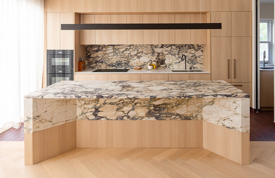
The island only. The bold stone sits on the island, and the perimeter benchtops use a quieter stone or a calmer section of the same material. This concentrates the drama in one place, like a sculpture in the middle of the room. It's often the most balanced approach in open plan homes, and Calacatta Viola is particularly effective used this way.
The island, perimeter and splashback. The stone appears everywhere. This is full commitment, and it works best in larger kitchens with good light, where the stone has room to breathe.
A single feature surface. Sometimes the bold stone goes on one surface only: a bar, a butler's pantry, a powder room vanity or a fireplace. Breccia is often perfect in this role, where a smaller, intense moment is more satisfying than a whole room. Our Breccia fireplace shows how one bold stone can lead a living room while white joinery keeps it calm.
What joinery suits a bold stone?
Quiet joinery is what makes a bold stone look intentional. Flat-panel or very simple shaker doors. A single colour. Minimal or integrated handles. The fewer lines and details in the joinery, the more the stone's movement can do its work.
Pick a joinery colour from within the stone's own palette, rather than a contrasting one. A warm white beside a stone with cream undertones. A deep tone that picks up one of the darker veins. That creates harmony, and harmony is what reads as calm.
Hardware is part of the supporting cast. Choose one metal finish and use it everywhere, whether that's brushed nickel, aged brass or black. Keep the tapware simple. A sculptural tap beside a dramatic slab can be lovely, but one statement is usually enough. The stone has already said a lot.
The Patagonia kitchen is a good example. A dramatic quartzite, a slim edge, a single waterfall and a shorter splashback. Every decision around the stone was a decision to hold back.
What colour joinery goes with Calacatta Viola, Breccia, Patagonia and Negresco?
These are the four bold stones we're asked about most. Colour names below are from the Polytec range that Kitchen Hub offers. Treat them as starting points to test beside the actual slab, because every slab is a little different.
Calacatta Viola
A warm white marble with burgundy, plum and gold veining. Pair it with a warm white such as Polytec Blossom White or Alabaster in a flat panel, or a warm timber such as Polytec Florentine Walnut, which draws out the burgundy tones in the veining. Aged brass picks up the gold in the veins. A honed finish calms the plum tones. Polished deepens them, which suits a more formal room. See the Calacatta Viola range.
Breccia Rose
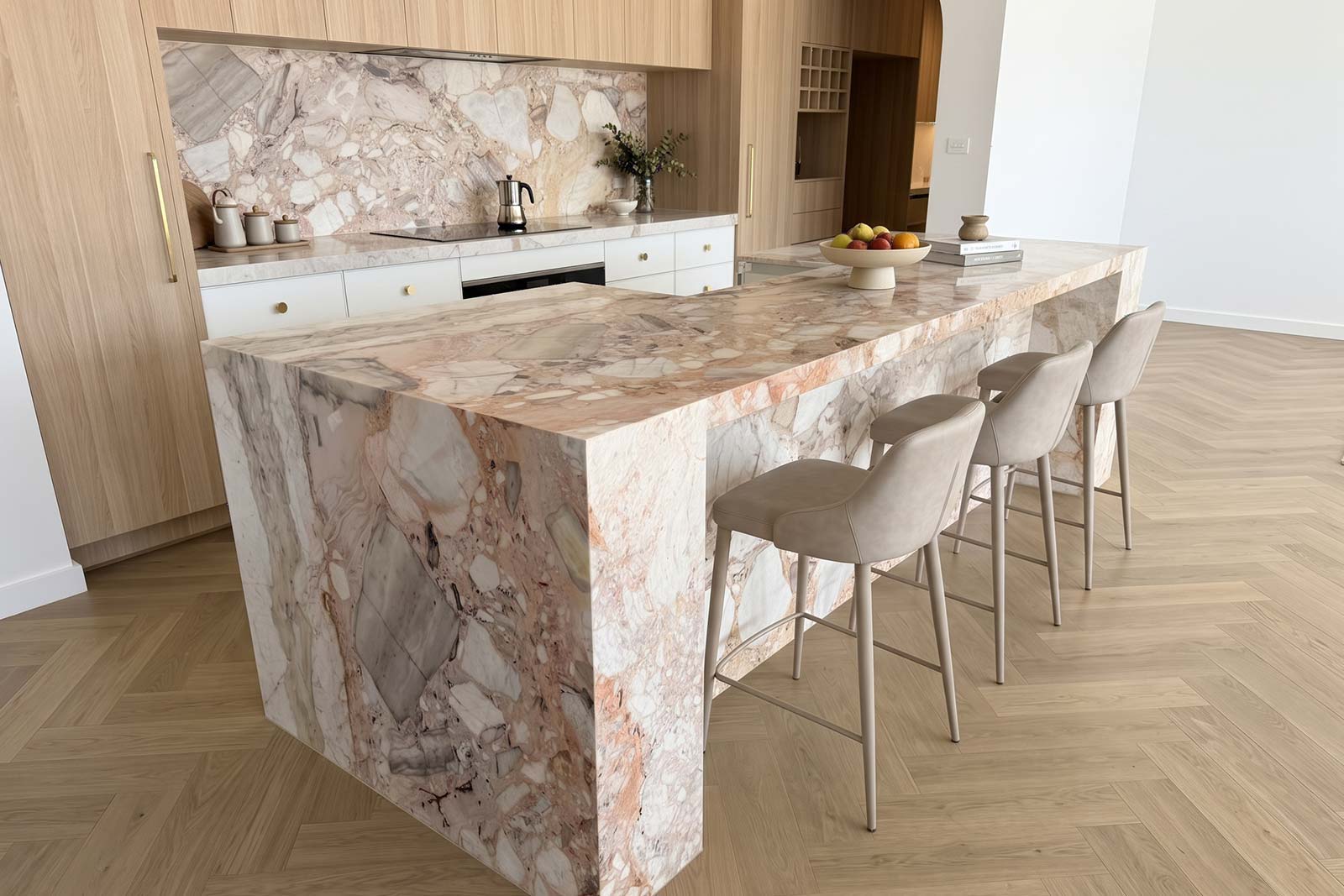
A beige marble with a mottled pattern of cream, white and pink. Stay inside its cream tones with Bone White or Parchment, warm it with Prime Oak, or set it against a moss green such as Polytec Topiary, which makes the pink in the stone glow. Brushed nickel keeps the pink crisp rather than sweet. Honed suits it best. See Breccia Rose (Botticelli).
Patagonia quartzite
Dark movement, garnet reds, blacks and translucent whites. It's busy, so the joinery needs to be very quiet: a neutral wood tone, or a soft beige such as Polytec Moss Grey or Malt, in a flat panel. Black or brushed nickel hardware. Being quartzite, it's forgiving polished, and its translucency means it can even be backlit. See the Patagonia range.
Negresco quartzite
A deep charcoal-to-black base with fine white veining, sometimes with gold tones. Warm timber is its natural partner, such as Natural Oak or Tasmanian Oak, with aged brass to pick up the gold. Choose honed or leathered over polished, because polished dark stone shows every fingerprint and crumb. See Negresco quartzite.
When colour is the bold choice
Sometimes the boldness comes from colour rather than veining. Green, pink and violet stones can feel risky. In practice, many of them behave like neutrals once installed. Our piece on green benchtops explains why Esmeralda quartzite sits so easily with timber and white.
Should the splashback match a bold benchtop?
Only sometimes. The splashback is where many bold-stone kitchens tip into too much.
If the stone is on the island only, a full slab splashback in the same stone can overload the room. A quieter material, such as a plain tile in a colour drawn from the stone, gives the eye somewhere to rest.
If you love the idea of stone on the wall, use a calmer section of the slab for the splashback and save the strongest veining for the island. That's a decision we make at slab selection, with the slabs in front of you.
How do you stop a bold stone making the kitchen feel heavy?
Bold stones carry visual weight. A dark, heavily veined stone reads heavier than a pale, soft one, and that weight changes how the room feels.
In a room with good natural light and high ceilings, a heavy stone feels grounded and luxurious. In a small, darker kitchen, the same stone can make the room feel smaller. Balance it with lighter surroundings: paler floors, lighter walls and open space around the island.
Dark dramatic stones like Negresco get their drama from depth rather than contrast. They work best where there's enough natural light to stop them reading as a dark mass.
Lighting matters as much as daylight. Warm, even light lets a bold stone glow. Harsh, cool downlights can flatten colour and create glare on a polished surface. A honed finish softens the reflection and makes a bold stone feel calmer.
Why does vein flow matter more with a bold stone?
With a bold stone, how the slab is cut matters more than with almost any other material.
We lay the templates over the actual slabs before anything is cut. We decide where the strongest movement sits, which direction the veins travel, and how they carry across joins, around corners and down waterfall ends.
A bold slab cut without planning can look chaotic. The same slab cut with care looks like it was designed for the room.
Dream kitchen or resale: is a bold stone a risk?
If this is your forever home and you've fallen for the stone, follow that instinct. It's usually right. You'll be the one living with it.
If resale is on your mind, look at what comparable homes in your price bracket are doing. In the premium market, distinctive natural stone often protects value. Our guide on natural stone and resale explains why, and how to choose your stone walks through the dream versus resale conversation.
A simple decision framework
Use the bold stone on the island only if you want impact with balance, especially in open plan homes.
Use it across the island, perimeter and splashback if the kitchen is large, the light is good, and you want full immersion.
Use it on one feature surface if you love the stone but don't want to live with it everywhere.
In every case, keep the joinery quiet, choose one metal finish, and plan the slab layout before cutting.
If you've fallen for a bold slab, book a design consultation. Bring photos of your space and your joinery samples if you have them, and we'll help you work out how much of the stone your room can carry.
Frequently Asked Questions
Will a bold stone kitchen date quickly?
Bold natural stones have been used for centuries, so the stone itself rarely dates. What dates is everything around it: trend-led joinery colours, busy tiles and fashionable hardware. Keep the surrounding elements quiet and the kitchen will age well.
Should I use a bold stone on the island or the whole kitchen?
For most open plan kitchens, the island only. It concentrates the drama in one place and keeps the room balanced. Using it everywhere works in large, well-lit kitchens where the stone has room to breathe.
What colour cabinets go with Calacatta Viola?
A warm white in a flat panel, such as Polytec Blossom White or Alabaster, lets the burgundy and plum veining lead. A warm timber like Polytec Florentine Walnut draws out the burgundy tones. Aged brass hardware picks up the gold in the veins.
What joinery goes with a dark stone like Negresco?
Warm timber, such as Natural Oak or Tasmanian Oak, with aged brass hardware. Choose a honed or leathered finish over polished, because polished dark stone shows every fingerprint and crumb.
Should the splashback match a bold benchtop?
Only sometimes. If the stone is very busy, a quieter splashback gives the eye a place to rest. If you want stone on the wall, use a calmer section of the slab for the splashback and save the strongest veining for the island.
How do you stop a bold stone looking chaotic?
Plan the vein flow before cutting. Lay the templates over the actual slab, decide where the strongest movement sits, and carry the veins in one direction across joins and corners. Planning is what makes a bold stone look designed.
What benchtop finish suits a bold stone?
Honed is often the safest choice. It softens reflection, reduces glare under downlights, and makes dramatic veining feel calmer. Polished deepens colour and contrast, which suits some bold stones, especially quartzites, in well-lit, formal spaces.
Can I use two bold stones in one kitchen?
It can work, but it's rarely calmer. If you love two stones, put them in different rooms, or pair one bold stone with a quiet partner, such as Calacatta Viola on the island and a soft white stone on the perimeter.
Stone Bathroom Walls and Showers: Full Slab, Porcelain or Tile
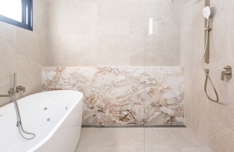
Stone on bathroom walls is what turns a tiled bathroom into a designed one. Full slab natural stone gives true vein flow and few joins, large-format porcelain is often the most practical choice inside a wet shower, and tile still suits complex shapes and tight budgets. Whatever you choose, stone is a finish, not waterproofing. This guide compares all three and covers marble in showers, joins, niches, floors and cost.
Stone Bathroom Walls and Showers: Full Slab, Porcelain or Tile

Granite Benchtops Are Back, and They Look Nothing Like the 90s
Granite sits mostly in darker and medium tones with a unique flowing pattern, and its dated reputation comes from what it was paired with in the 1990s, not the stone. With today's joinery, flooring and a honed finish, granite benchtops look timeless. It's hard, forgiving, resists etching and suits busy kitchens, outdoor areas and bathrooms. This guide covers pairing, finishes, real Marble Hub projects, granite vs quartzite, marble and dolomite, and how to choose a slab.
Granite Benchtops Are Back, and They Look Nothing Like the 90s

Waterfall Benchtops: Where They Add the Most to Your Kitchen
A waterfall benchtop takes the stone down the side of the island to the floor, so the island reads as a solid, sculptural piece of stone. This guide covers what a waterfall adds, how it compares with a standard island end, how many waterfalls to have, and the three corner finishes: mitred, shadowline and butt join. On timber floors we always suggest a shadowline. It also covers vein flow and what adds to the cost.
Waterfall Benchtops: Where They Add the Most to Your Kitchen

Outdoor Stone Benchtops That Survive a Sydney Summer
An outdoor benchtop in Sydney has to handle sun, heat, salt air, dust, rain and BBQ fat on the same surface. Porcelain and sintered stone are our first pick, granite is the best natural stone outdoors, and quartzite works with regular sealing. Light-coloured marble is best avoided outside, and engineered stone belongs indoors only, as UV affects it and outdoor use voids the manufacturer's warranty. This guide also covers joins, BBQ heat and why butt joins or shadowlines often outlast mitres outdoors.
Outdoor Stone Benchtops That Survive a Sydney Summer
Let’s Get Started on Your Dream Space
Whether it’s a kitchen, bathroom, or laundry, Kitchen Hub is here to bring your vision to life.
