
Add slabs to your wishlist so we can give you custom quote.
Add productions from our slab collection so we create a quote for your next project!
If you're unsure of what you're after please reach out via our contact page.
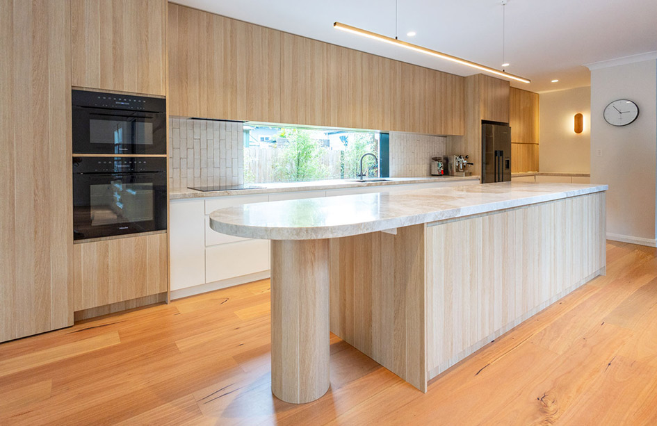
Custom Joinery and Taj Mahal Quartzite: What This Kitchen Got Right
Custom Joinery and Taj Mahal Quartzite: What This Kitchen Got Right
PROJECT FOCUS
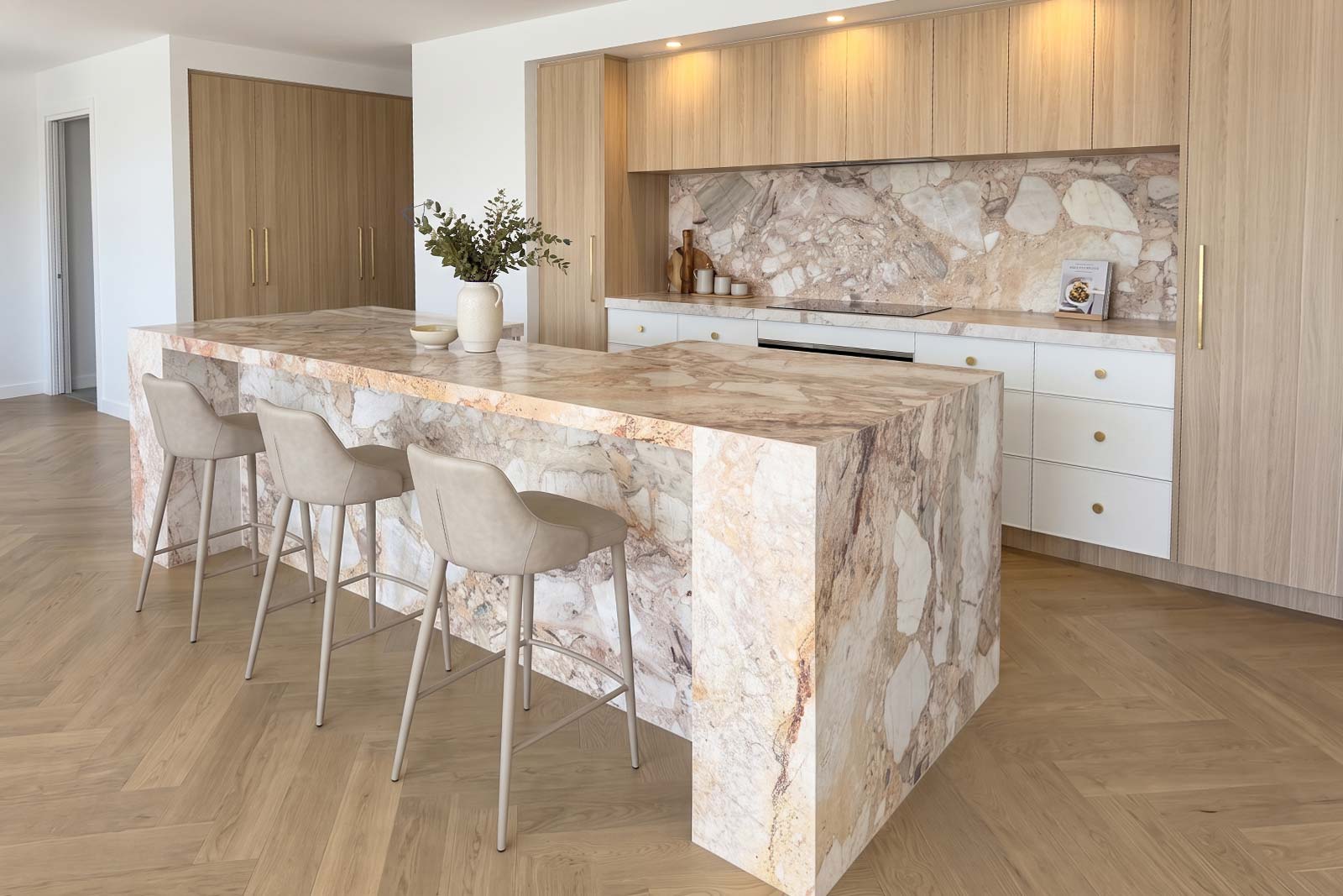
This kitchen was built around four things: space planning shaped entirely around how the client cooks and lives, a brief driven by her specific requirements rather than a standard layout, hidden features, including a bar built around a structural column, designed to work invisibly, and a book-matched Taj Mahal quartzite island that anchors the whole room.
Design, joinery, stone, and install carried out entirely in-house.
Most people start a kitchen renovation with a stone in mind. A colour, a vein pattern, something they saw and can't stop thinking about. Then the joinery brief lands on the table, and the real project begins. Structural columns that can't move. Wall ovens that need somewhere to live. A pantry the client wants open, not boxed in behind a door. A bar for entertaining that has to sit near the outdoor doors, not buried in the main run.
This is one of those kitchens. Over 10 metres of joinery and stone, worked through closely with the client from the first conversation, with design, joinery, stone, and install all carried out in-house.
The client came in with clear, specific requirements: concealed appliances, a proper entertaining zone, a pantry that stayed open but still looked considered, an island with real seating rather than a standard overhang, book-matched stone across that island, and a kitchen that could genuinely handle daily family life. Having one team on the project from first sketch to final stone template meant nothing got lost between trades.

01 — JOINERY AND SPACE PLANNING
Joinery and Space Planning: Function First
Function and space planning mattered enormously to this client, so that's where the conversation started. It never became a separate conversation from the stone or the joinery finish. Layout, colour, and material were discussed together from the beginning, as one cohesive brief rather than a series of this-then-that decisions.
That planning shows up first in storage. A lot of kitchens have plenty of storage and still feel disorganised, because the storage isn't zoned to how people actually cook. This kitchen zones properly, based on how the client described her own routines. Pots and pans get a dedicated deep drawer near the cooktop. Cutlery has its own drawer. A pull-out bin keeps waste completely out of the main cabinetry run, so it's never in the way during prep. Vertical partitions run through several of the drawers and the pantry storage, keeping trays, boards, and smaller items upright and separated instead of stacked and searched through.
None of this shows up in a photo. It only shows up when you're cooking, which is exactly why these conversations happen early, and why they need to happen with the client directly rather than being assumed. The extra depth built into the base cabinetry supports the same goal: genuine bench space and real clearance around the cooktop, sink, and tap, enough for two people to work at once without bumping elbows.
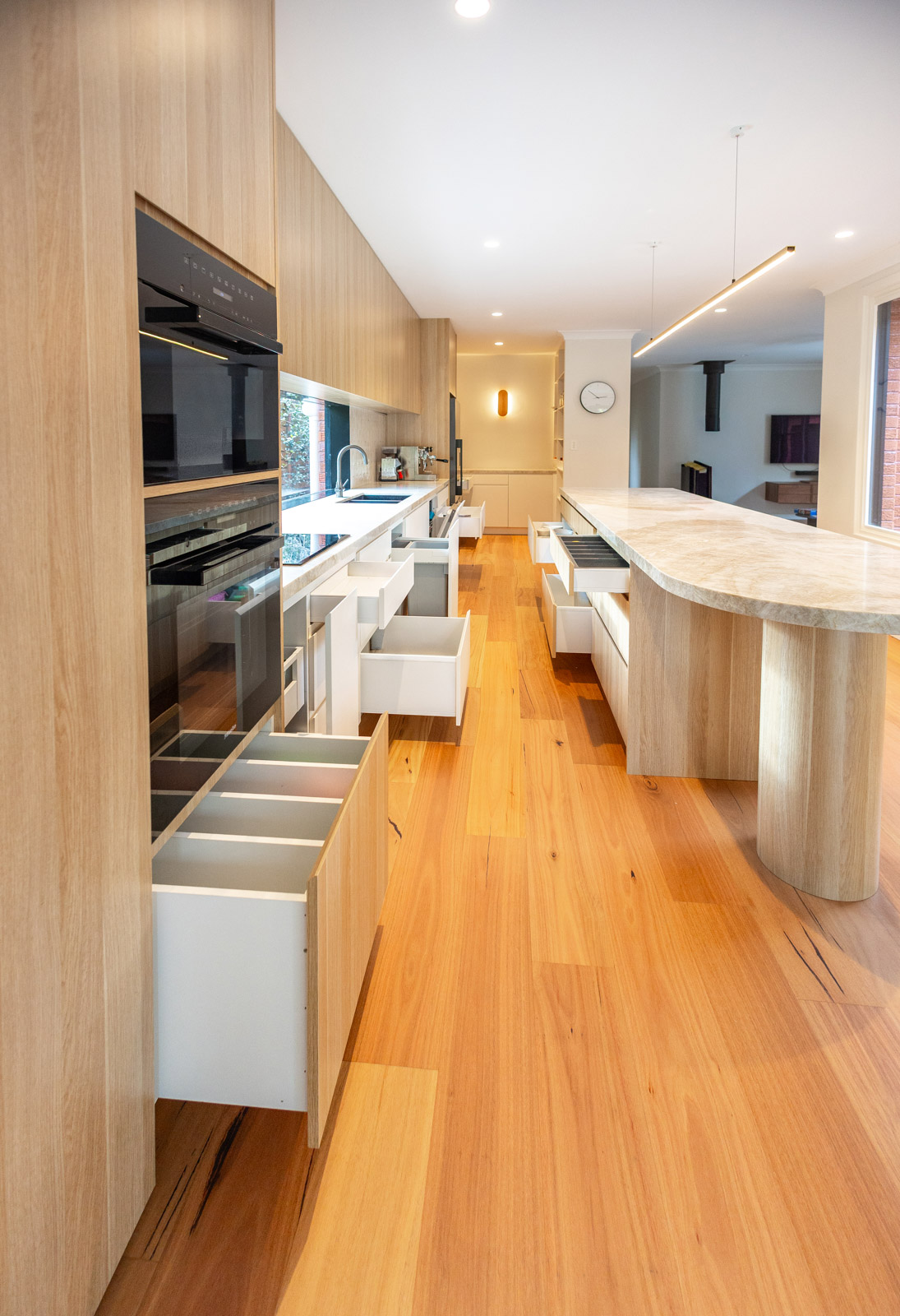
The joinery profile carries that same discipline through to how it looks. The cabinetry is polyurethane, flat profile doors, finished in a warm oak across the tall and upper cabinetry. There are no handles anywhere. Every door and drawer uses a sharknose finger pull instead, a routed edge that lets you open the cabinetry with your fingers rather than reaching for hardware.
This was a specific request from the client, and it's a good instinct. Handles are one of the fastest ways to date a kitchen. A flat profile door with a sharknose edge keeps every sightline clean, which matters even more in a kitchen doing this much work behind the scenes. The dishwasher is panelled to match, so it disappears into the run instead of announcing itself as an appliance. Blum hardware and soft-close hinges run through every door and drawer, including the Aventos lift systems on the tall cabinetry that houses the wall ovens, letting them lift clean and flush instead of swinging out into a walkway.
The warm oak tone carries its own weight too, running warmth through the tall cabinetry and the island without ever competing with the stone.

02 — THE ISLAND
Taj Mahal Quartzite, Book-Matched, on a Timber Post Instead of an Overhang
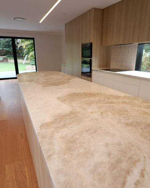
This is the standout decision in the project, and one the client was closely involved in from slab selection onward. The island top is Taj Mahal quartzite, book-matched, meaning the slabs either side of the join are cut and laid so the veining mirrors across the seam rather than jumping. It's a more deliberate slab selection and layout process than a standard single-direction lay, and it's the reason the island reads as one continuous piece of movement rather than two benchtops pushed together.
Taj Mahal earns that attention. The warm cream and honey tones anchor a kitchen this size without feeling cold, and the veining is subtle enough to spread across a large island without becoming chaotic.
Instead of a standard stone overhang with stools tucked underneath, the island uses a round timber post as both structural support and a design feature. The Taj Mahal top curves around it, creating a real seating nook rather than a strip of benchtop you perch at for five minutes. This was a genuine collaboration between the client's vision for how she wanted to entertain and the structural and stone expertise needed to actually build it.
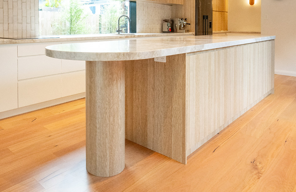
A cantilevered stone island isn't just a benchtop with an edge. Done well, it becomes a genuine design statement, the kind of piece that anchors the whole room. A confident, well-proportioned island lets the eye move straight past the support, so the space still feels open even with a bold slab commanding it.
The timber leg is what makes that possible. It gives the family a real place to sit and gather, and it lets the stone cantilever out from the post as a unique design feature in its own right. The post carries the structural load the stone's weight demands without announcing itself, function hidden inside the design rather than sitting on top of it.
It changes the psychology of the space too. A bench with stools facing a wall of cabinetry is a quick-stop zone. A curved bench with a post that gives it real presence is a destination, exactly what the client wanted for her family and friends.
03 — HIDDEN FEATURES
Hidden Features: Placement Matters as Much as the Feature Itself
Two decisions in this kitchen come down to placement rather than product, and both came from listening closely to how the client actually lives in her home.
The Hidden Coffee Station
Tucked out of the main sightlines, its position had to be resolved before the stone template happened, not after. Bench space, power points, and splashback height around it all needed planning at the joinery stage, based on exactly where and how she wanted to use it.
The Hidden Bar
The bar's location took real thought. It's built to conceal a structural column, and it sits close to the dining area and the back sliders, easy for guests to reach without thinking about it, and easy to duck in and out of during entertaining. Put it anywhere near the main run of the kitchen instead and it disrupts the actual function of the space, people cooking, people passing through, people trying to get to the fridge, all crossing paths with whoever's pouring a drink.
The column itself wasn't going anywhere. Most kitchens would either box it in as a visible feature or shift the whole bar to a less useful spot to avoid it. Neither was right for this brief. Instead, the joinery was built around the column so it does the structural job it's there for without reading as a feature or an obstruction. Stand at the bar and there's no sense that a support is dictating the layout. It just looks like a considered piece of cabinetry that happens to sit exactly where it should.
That's a harder brief than working with a clear run of wall, because every panel and return around the column had to be measured and templated to the column's actual position rather than a standard cabinetry module. Closed away behind pocket doors rather than swinging cabinetry, it stays out of the way during entertaining without ever competing with the cook's space, and without ever letting on what it's built around.

04 — SIGHTLINES AND THE PANTRY
Sightlines and the Pantry: Hide What's Visible, Not Everything
Most kitchens either hide too much or too little. Too much, and you get a wall of identical panels with no life in it. Too little, and the working mess is on display the moment someone walks in.
The right approach is neither. It's sightline logic: work out what's actually visible from where people stand, sit, and walk, and only conceal that. In this project, that logic was shaped directly by the client's brief. She wanted her appliances properly out of sight, but she didn't want a kitchen that felt closed off or over-boxed to achieve it.
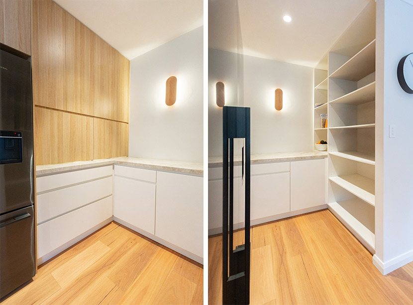
The clearest test of that principle is the walk-in pantry, which has no door, a specific requirement from the client. That's a harder brief than a closed pantry, not an easier one, because every shelf becomes part of the kitchen's visible design whether you planned for it or not. Working through it together, open shelving and bench space landed in the zones she'd actually see day to day, while anything she wanted kept out of view sits outside those sightlines, concealed without needing a door to do it.
The principle: you don't earn a calm kitchen by hiding everything. You earn it by hiding the right things, and knowing which things matters depends on understanding how the client actually wants to live in the space.

Two Rules to Remember
The sightline rule: Hide what's visible, not everything. That only works when you understand, specifically, how the client wants to use the space.
The sequencing rule: Joinery decisions, structural constraints, and stone design have to be worked through together, early, in close conversation with the client, before fabrication starts. The bar built around the structural column is the clearest example: had that constraint surfaced after the joinery was designed instead of before, the column would have ended up as a visible obstruction instead of an invisible one. A kitchen designed in the right order looks inevitable. One designed out of order looks like a beautiful slab sitting on top of compromises nobody planned for.
The Reality Check
Book-matched quartzite and a curved, structurally supported island cost more in slab selection, fabrication, and template time than a straight cantilever with a single slab lay. The veining has to be matched deliberately, the curve cut cleanly, the post positioned with genuine structural accuracy, and the whole island templated on site rather than pulled from a standard shape.
That's a real decision, and it's one worth making with eyes open. If the island is actually going to function as a dining and gathering space, the extra time pays for itself in how the kitchen gets used. If it's only ever a quick coffee stop, a standard overhang does the job for less.
FAQ
Does book-matching a quartzite island cost significantly more than a standard slab lay?
It depends on the stone and what you're trying to achieve with the final result. Book-matching requires selecting slabs specifically for how their veining will mirror across the join, then laying and templating them to line up exactly, and that only adds meaningful cost if the veining and the layout actually call for it. Some slabs have movement dramatic enough to justify it. Others are calm enough that a standard lay looks just as intentional for less. It's worth the extra time and cost if the island is a genuine gathering space people will sit at for hours and the stone has veining that rewards the effort. If it's a quick coffee stop, or the slab's movement is too subtle to read across a join anyway, a standard lay does the job for less.
Can any kitchen island be built with a cantilevered stone top like this one?
Not without engineering the support first. The stone's weight, the span of the cantilever, and the structural post all have to be worked out together before fabrication, which is why this kind of island gets templated on site rather than cut from a standard shape. A structural post, like the timber leg used here, is often what makes a genuine cantilever possible.
Why would you choose a handleless kitchen over standard cabinetry?
Handles are one of the fastest details to date a kitchen. A flat profile door with a routed finger pull, like the sharknose edge used in this project, keeps every sightline clean and ages more slowly. The trade-off is that the door profile itself has to be considered from every angle, since there's no hardware to distract from it.
Why leave a walk-in pantry without a door?
An open pantry is a harder brief than a closed one, not an easier one, because every shelf is now part of the kitchen's visible design. Done well, it puts the items you actually reach for in view and tucks the rest away. Done without planning, it just becomes clutter on display.
How do you hide a structural column in kitchen joinery?
You build the cabinetry to the column's actual position rather than a standard module, so it takes on the load-bearing job it's there for without reading as an obstruction or a feature. It's more work at the templating stage, but it means the column disappears into the design instead of dictating the layout.
Ready to Plan Yours?
The best kitchens come from a genuine back-and-forth: your must-haves and non-negotiables, matched against what's structurally and practically possible. Bring your actual floor plan and your requirements to a consultation before any stone gets chosen.
We'll walk through how joinery and stone work together in your specific space, and where the trade-offs are worth making.
Book a design consultation to talk through your kitchen's layout, storage needs, and the joinery and material choices that will make it feel intentional from day one.
Where to Start When You Don't Know the Stone in Your Inspo Photos
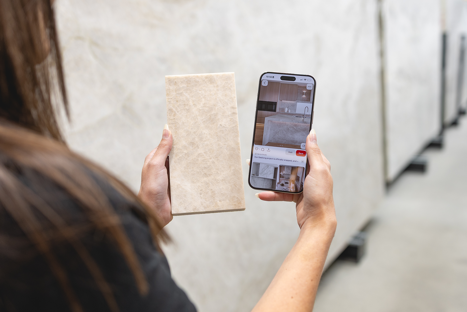
For homeowners who don't know where to begin with stone. You don't need a stone name to start. Send your inspiration photos, tell us what you like and why you're drawn to it, and we'll identify the material and point you to the right slabs. Covers how your eye already picks matching tones, reading stone from a photo, which photos to trust online, and why picking stone is like picking art. Tags: how to choose stone, where to start, inspo photos, identify marble from photo, stone selection, Marble Hub Sydney.
Where to Start When You Don't Know the Stone in Your Inspo Photos
Backlit Stone and Why the LED You Choose Changes Everything
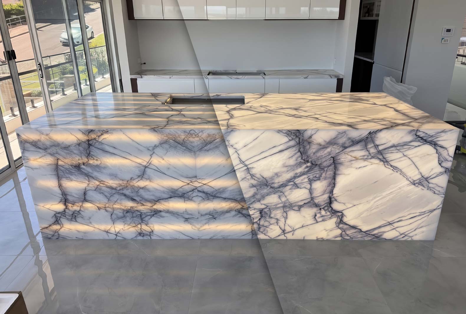
Backlit stone explained simply. The look changes a lot with the light behind the slab. LED strips give a striped, patterned glow; a full LED panel lights the whole slab evenly so it looks lit from within. Both are valid, so do what suits your budget, but plan it early with your electrician. Covers which stones are translucent and why the light install feeds into the check-measure. Tags: backlit stone, backlit marble, translucent stone, LED stone panel, backlit onyx, feature lighting, Marble Hub Sydney.
Backlit Stone and Why the LED You Choose Changes Everything
How We Plan Stone Across a Duplex Without Wasting a Slab
Planning stone across a duplex or dual-occupancy build. We work out real slab count, map every piece across the slabs, balance feature stone across both homes, and plan the stages so the check-measure and install land when each side is ready. Covers slab yield, offcut planning, mapping the cut to the stages, and getting every trade working to the same target dates. Tags: duplex stone benchtops, dual occupancy, slab count, stone yield, staged install, trade coordination, Marble Hub Strathfield South.
How We Plan Stone Across a Duplex Without Wasting a Slab

How to Clean and Care for a Marble Benchtop
How to clean and care for a marble benchtop, written for people who already own marble or are about to. Covers the daily routine, warm water and pH-neutral cleaner, wiping acidic spills fast, sealing with Lithofin MN Stain-Stop every 6 to 12 months, and the difference between a stain and an etch. Explains why heavy veining hides marks better than plain marble, and why a rehone and rebuff after 3 to 4 years brings a tired benchtop back. Honest about trade-offs. Marble is a relationship, not a set-and-forget surface. Written by Marble Hub, a Strathfield South stone factory and showroom.
How to Clean and Care for a Marble Benchtop
Let’s Get Started on Your Dream Space
Whether it’s a kitchen, bathroom, or laundry, Kitchen Hub is here to bring your vision to life.
